A histogram in R is very useful to use when you want to see more detail on all of the data within your data set. A histogram in R can be used early in your data evaluation process just to get a cursory look at the data to see if it is making sense logically.
Laerd Statistics has a great summation of histograms: A histogram is a plot that lets you discover, and show, the underlying frequency distribution (shape) of a set of continuous data. This allows the inspection of the data for its underlying distribution (e.g., normal distribution), outliers, skewness, etc.
The goal of this post will be to show you how to run multiple versions of a histogram in R. To show examples of creating a histogram in R we will use the latest NFL quarterback data. If you want a copy of the live data you can go to our Google doc and download the data and use. The data updates automatically on each load of the page.
Below is a screenshot of the data:

We will add the CSV of QB data into R. One thing that we did as a clean-up measure was to remove any quarterback who had less than 100 completions. You can decide which data you want to keep or remove but for the sake of writing this post we chose that as our dividing line.
The first thing that you must make sure to do is put the csv file in your working directory. If you forgot how to check your working directory or setting read our tutorial here.
The actual CSV used for this tutorial can be downloaded here.
>df <- read.table("nflQBData.csv", header=TRUE, sep = ",") ##import the csv as a data frame
>View(df) ##view above your console the imported data and structure
Now that your data has been imported you can now start to create a histogram in R:
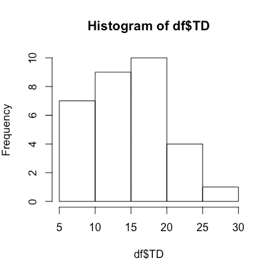
>hist(df$TD)
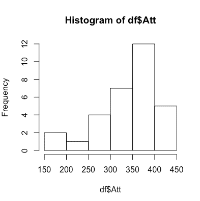
>hist(df$Att)
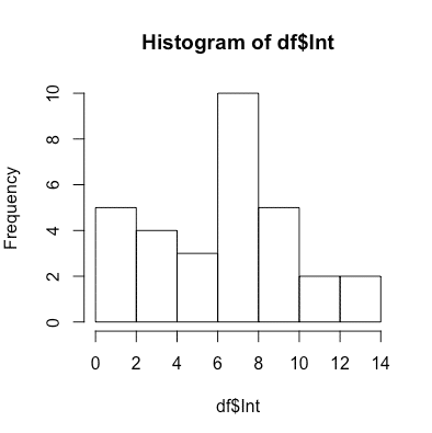
>hist(df$Int)
Above we created three histograms. Each histogram in R can give you a quick glimpse at the data to show if it makes sense and passes the eyeball test. The histograms we used for quarterbacks were: touchdowns, attempts and interceptions. Again, this is very simple use of the data but it could tell you if you had millions of rows if the data appears to be roughly correct and if there were outliers.
Below are example images of each histogram in R.
For hist(df$TD), which are touchdowns, we showed the following histogram in R:

For hist(df$Att), which are attempts, we showed the following histogram in R:

For hist(df$Int), which are interceptions, we showed the following histogram in R:


